
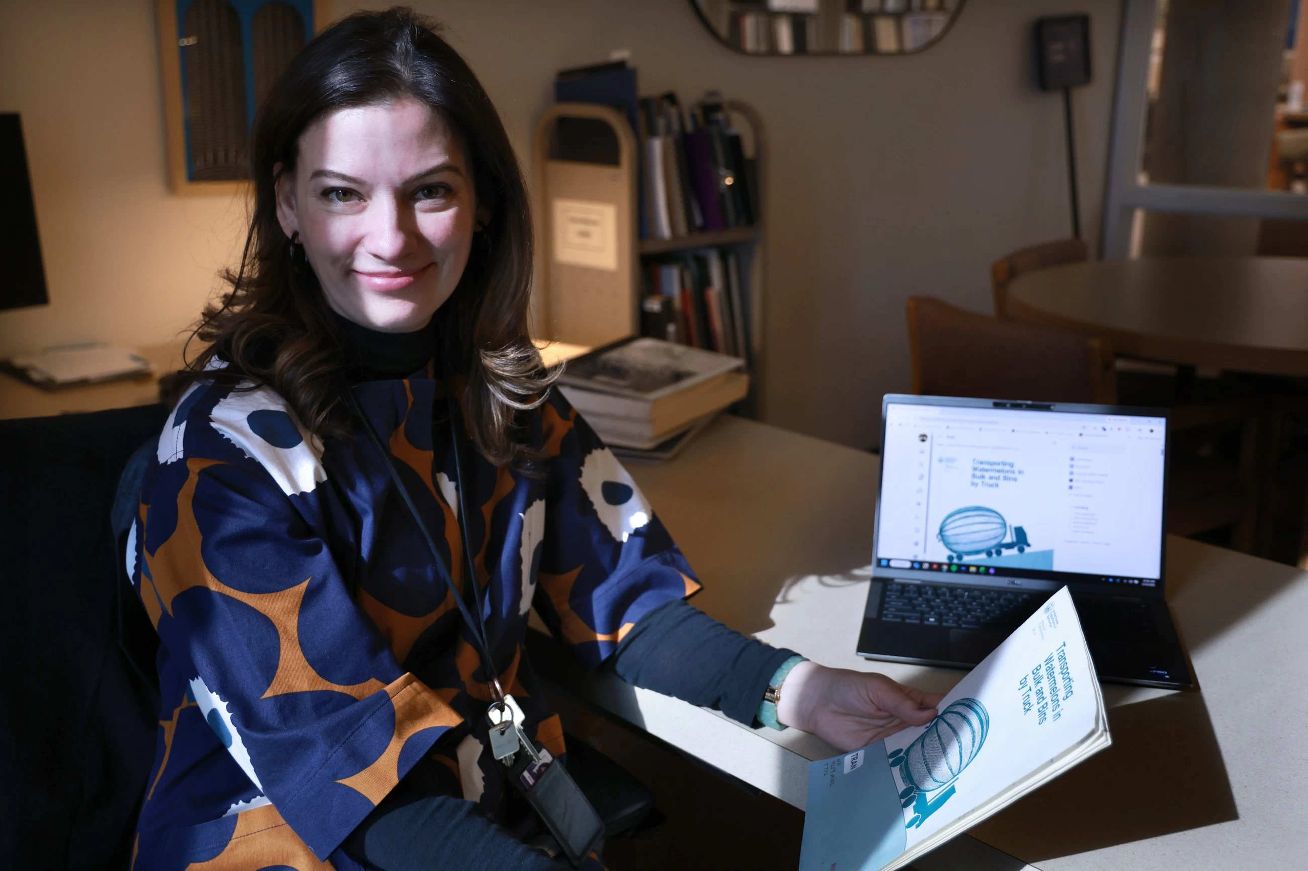
Government reports tend to make for less-than-scintillating reading. That’s the nature of the beast. Data can be dry. But for the better part of the 20th century, the covers of these reports were works of art. “Transporting Watermelons in Bulk and Bins by Truck,” a 1982 report for the Department of Agriculture, features an illustration of a semi-truck. But instead of hauling a trailer, the cargo is one gigantic watermelon, with an adorable tail on the end.
A 1964 annual report for the Missouri State Highway Commission titled “A Report of Highway Death in Missouri” appears to be inspired by the minimalist, geometric movie posters created by Saul Bass in the ’50s and ’60s. Against a black background, the red lettering of the title is all but crushing a prone human form. The title may be clinical and detached; the image on its cover is anything but.
Rachel Cole is the curator at the Northwestern University Transportation Library and she has been scanning these report covers and then posting them in an ever-expanding Bluesky thread as a way to interest the general public in the library’s catalog. At one time, it wasn’t uncommon for universities to have a dedicated library focused on all things transportation. That’s no longer the case. There’s one at the University of California, Berkeley, but “they don’t have a physical collection like they did in the past,” Cole says. “The University of Michigan still maintains its transportation collection, but doesn’t have a dedicated library or librarian overseeing it. We’re really the only one of our kind, with over 500,000 volumes related to all modes of transportation: Car, boat, train, aviation, bicycle, pedestrian. We say if it moves people or goods, we collect in that area.”
Founded in 1958, the transportation library is located within Northwestern’s main library on the fifth floor and it is open to the public. “We’re tied to the transportation centre here on campus,” says Cole, “so things like engineering, but also how that impacts the environment and the economy, as well as social impacts.” Her work often requires going into the stacks for research materials, and she inevitably comes across these old reports. “They’re just such fun images and I wanted to share them with someone.” She maintains an Instagram account for the library that’s focused on transportation ephemera — “airline menus, timetables, photograph albums, that sort of thing” — but the report covers have a “different aesthetic and different perspective about transportation, so that’s why I thought I’d share them on BlueSky instead. They’re really interesting for the visual aspect. A lot of thought and care was put into these covers on topics that might be considered mundane. But I’m also interested in what they tell you about transportation history throughout the 20th century.”
A 1976 report for the Department of Transportation is titled “Problems of the Carless” and it features an illustration of a man with a cane and a bag of groceries, alone at a desolate bus stop. A 1974 report for the Department of Transportation titled “Bikeways — State of the Art” has an illustration drawn in the style of MAD Magazine’s Mort Zucker of a besuited man standing next to a highway, chipping a bicycle from a mound of concrete. He’s attacking the job with gusto!
And a report from 1977 titled “Low-Fare, Fare-Free Transit: some recent applications by US transit systems” features a triptych on its cover. The first panel shows a man waiting for public transit and it’s labeled “fare 50 cents.” In the second, it’s a man and two women waiting, “fare 25 cents.” The third shows an entire crowd that’s labeled “fare free.” The drawings have a sense of whimsy, yes, but are also very clearly telling a story. “What’s so striking about these reports is that they are half a century old, and yet we’re still talking about the same issues and still haven’t figured this stuff out satisfactorily,” Cole says.
It’s fascinating to consider that, at one time, government agencies dedicated money and energy to the messaging conveyed by this cover art. Guy Villa is a graphic designer who is co-owner of the studio Sharon and Guy with his wife and fellow artist Sharon Oiga. He is also a professor at Columbia College Chicago who teaches graphic design. “The perfect example is the report on Missouri highway deaths,” he said. “I’m a big fan of Saul Bass and that image is mimicking the poster for 1959’s ‘Anatomy of a Murder.’ And it’s like, wow, someone was actually brave enough to put a dead body at the bottom of an annual report. Even the typography is very post-modern. I think they wanted to get enough readers engaged to show: This is a serious thing that is happening. And that cover is going to catch your eye in a way that just putting basic typography on a white background isn’t.”
Cole also finds that one interesting “because many times an agency may want to highlight its accomplishments for the year, or a new road-building project, but here they’re highlighting the dangers of traffic and traffic deaths. That they’re highlighting the ways that they haven’t succeeded is really interesting.”